File:MER Star Plot.gif

From formulasearchengine
Jump to navigation Jump to search

MER_Star_Plot.gif(560 × 438 pixels, file size: 28 KB, MIME type: image/gif)

This file is from Wikimedia Commons and may be used by other projects. The description on its file description page there is shown below.

Summary

Description
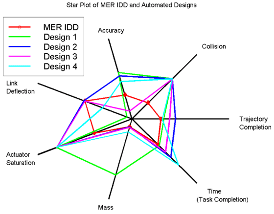
English: Star plot

In this star plot, the center represents the most desirable results. The red line represents the handcrafted MER IDD, and is used for comparison and validation of the approach.

This graph illustrates the fact that improvements in one metric often come at the expense of others. However, design samples 3 and 4, which were among the last of the 10 actually produced, show the best overall results in the most important metrics.
Date
Source Automation Tool for Rapid Design of Space Systems
Author NASA Primary START
Other versions
This graph image could be re-created using vector graphics as an SVG file. This has several advantages; see Commons:Media for cleanup for more information. If an SVG form of this image is available, please upload it and afterwards replace this template with {{vector version available|new image name}}.


It is recommended to name the SVG file “MER Star Plot.svg”—then the template Vector version available (or Vva) does not need the new image name parameter.

Licensing

Public domain This file is in the public domain in the United States because it was solely created by NASA. NASA copyright policy states that "NASA material is not protected by copyright unless noted". (See Template:PD-USGov, NASA copyright policy page or JPL Image Use Policy.)
Warnings:

Captions

Add a one-line explanation of what this file represents

Items portrayed in this file

depicts

5 March 2008

image/gif

File history

Click on a date/time to view the file as it appeared at that time.

Date/TimeThumbnailDimensionsUserComment
current00:51, 15 October 2008Thumbnail for version as of 00:51, 15 October 2008560 × 438 (28 KB)wikimediacommons>Mdd{{Information |Description={{en|1=In this star plot, the center represents the most desirable results. The red line represents the handcrafted MER IDD, and is used for comparison and validation of the approach. This graph illustrates the fact that improv

There are no pages that use this file.